Friday 26 April 2013

Double Page Spread Final Cut

Rough Cut


Final Cut
Making the comparison I would say that the I prefer my final cut layout much better than my rough cut. I positioned the three photos a little more tilted and in polaroid backgrounds to add a little composition to the page. They are still in black and white to not take any main attention away from the main image. I decided to keep the main image and to have the text bending around the arm and body.I kept the bigger S and changed the colour to complement the coloured text more. I decided to remove the coloured blocks of navy as it was too bold for the page and looking back at my research it is more conventional to have a white background on a double page spread. I used the quote at the top of the page in a unique font different to the rest of the page. I put a caption on the photo as it was conventional for double page spreads and I also used similar header and footers to the contents page and to give the pages more structure. I finished my article and used a quote in the center of the page as I found out this is conventional. I separated the quote with the similar lines showing clearly that this part of the text is different from the rest. I also took the photo on photoshop and edited it out of the background so I could place it on the page without the grey. 


Thursday 25 April 2013

Contents Page Final Cut

Rough Cut 

Final Cut

As you can see from the comparison I made miraculous changes to the rough cut regarding the colours fonts and header. I put the contents in black and made it italics. I then put a line above the contents to mark the header then used the date and logo on the right hand side. I chose to change the colour of the banners across the page to blue then used the red blocks as they were more conventional to my style model. I decided to take the drop shadows of the text however kept them on the little boxes to make them stand out. I then used the red colour and adapted the page numbers to the corners of the photos. I developed one of my photos as suggested in my rough cut to vary the backgrounds and too add a little more colour to the page. I added captions on the photos to let my audience understand a bit more about the images. I added a footer on the end to match the blue coloured header. I then used the page number on the right hand side to make it look more professional with more to look at on the page. 


Front Cover Final Cut

This is the final cut of my magazine front cover compared to my rough cut:

Rough Cut
Final Cut
I have made miraculous changes to from my rough cut. I have decided to change the colours and title to be more conventional. The navy has been changed to blue and the fonts are clearer and more conventional. They are taller and thinner to look blocky and cleaner on the page. As you can see I kept the 'Scarlett Hudson' the same only slightly tilted it on the page to fit more plugs around it. I varied some of my text from being bold and italic or different colours. I changed the banner on the bottom of the page to be more artists names as my model magazine uses lots more artist names to to attract a wider audience as they have constituencies around them. I moved the bar code to the other side to match my NME Rihanna style model. I decided to re photoshop my main image to make the hair look neater and cleaner against the dark title. I added a couple of little touches around the page such as the extra lines of blue. I copied my style model's date and price above the title in a smaller font slightly italic with the price in the blue colour. I decided to use rounded colour plugs around the top of the page to add a little extra content. 


Rough Cut Double Page Spread

My Rough Cut Double Page Spread:

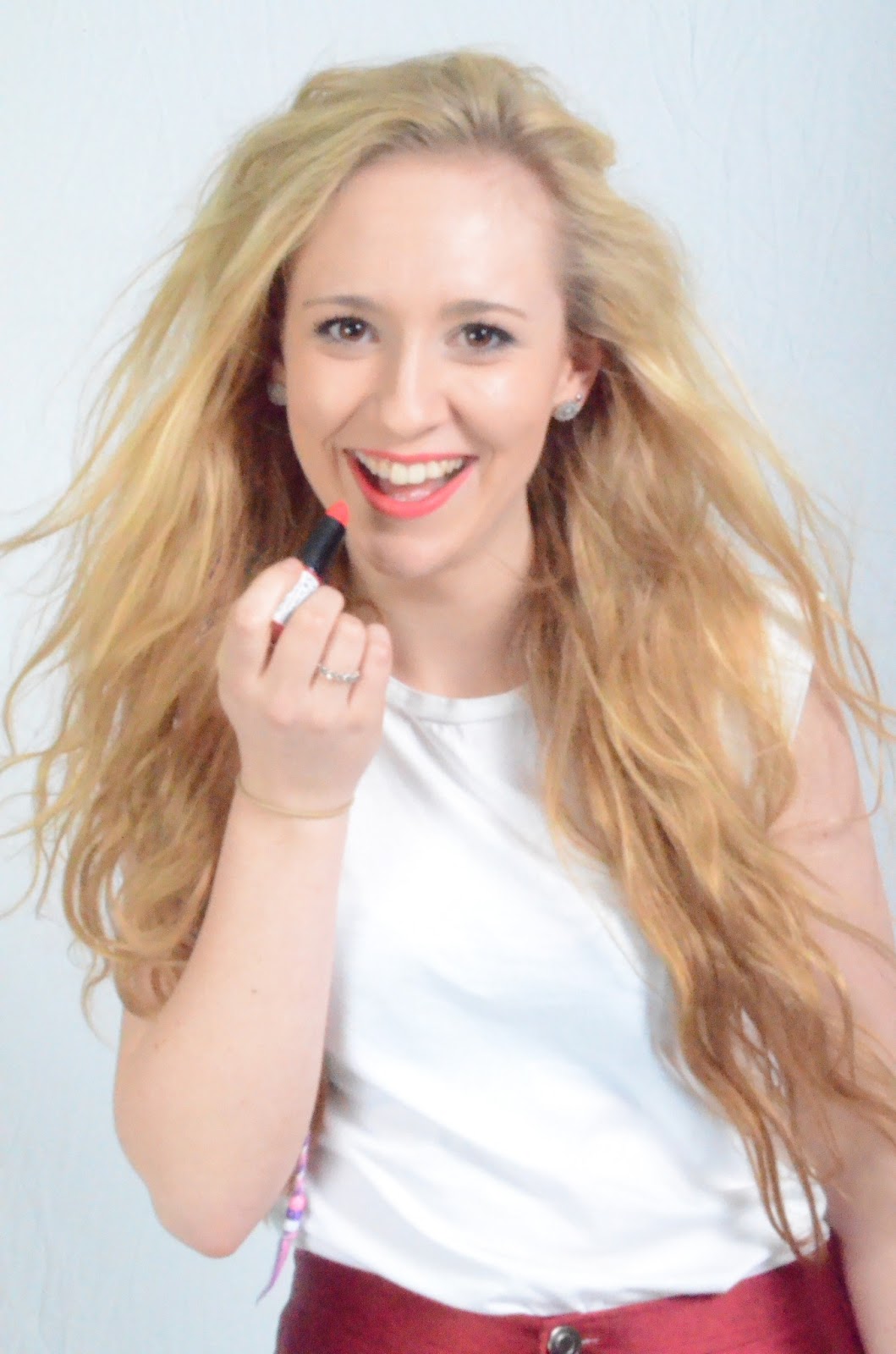
Firstly I would like to point out that this rough cut is unfinished and needs more features to be added on as it lacks in quantity on the page. I have chosen to use the main photo in the center of the page, conventionally, and bend the text around the photo which I believe is effective and makes an impact on the page. I also used a variety of other close up photos on the left hand side of the page. I changed all colours to black and white to not draw the attention away from the main photo. I positioned the quote marks a bit thicker and the plan is too use the quote and to position it in a different colour and style. I put a little section above the 3 columns of articles to give the audience a little information before they start reading the article. I have decided to use a bigger font for the starting letter 'S'. This gives a clear indication of where the article starts. I have also given the photo a witty caption saying 'Scarlett Hudson breezes through her first ever photoshoot'. I placed this text in a little text box with a red background to match the fonts and lipstick. I added a line of text running along the bottom of the article with a little extra 'Download' of her new single. I also used the page number and put it all in different fonts and colours to keep the variety. 
Peer Review


Whilst collecting information on what my peers thought of my double page spread, the main thing that was mentioned was the unfinished article. This is currently in progress and will be done for the final deadline. I am planning to structure the article around the new lifestyle the artist is experiencing and what fame has done to her and how she feels. They are very conventional questions asked for a fresh new teenage star and will fit in the three columns I have provided next to the image. My peers agreed that the images on the side were effective however said that they could have a little more dominance by putting a border round. My idea for this is to put polaroid style boxes around the pictures in order to give a little design to the page. My peers also recommended using different font and colours that match the new contents page and front cover as they navy is not effective as I imagined. They said to take out the navy boxes and add a little more white to the page. 

Teacher Review

The initial comment my teacher has given me is to cut out the photo out of the grey background and place it on the white page. This will make the image look more effective and hopefully create a better impact to the bent around text on the page. My teacher also agreed with my peers about the fact the navy columns need to be rethought and reconsidered. On suggestion that I will make changes too is putting a quote into the article. This quote will be broken up by coloured lines which will be repeated to for the header and footer lines. If I am deciding to use a different font i will need to change all of the features of my double page spread. My teachers were very positive about the photos taken as they are clear with clear backgrounds which can be adapted to the page. 

Rough Cut Contents Page

My Rough cut contents page:


In my contents page I decided to keep the colour scheme and fonts the same just like my style models NME and Q do. This is effective as the magazine has a sense of unity about it and can be related to each other. The navy title was used for the dominant Contents headline at the top of the page. I used a similar photo to the front cover of the artist with her lipstick as the focus and in white and red to match some of the font colours. I also imposed her head and hair over the band of colour used to identify the features part of my page. I used the band of colour further down the page to break up the text and to make it not look too informative as requested by my target audience when doing my research. I decided to take more photos that feature on the page to create the picture layout as it was also preferred by my target audience whilst carrying out my questionnaire. I took the time to use an unusual instrument choice of a saxophone and captured an interesting photo of a young girl playing it. This was a mid-shot and differs from the medium close up I used for the photo of my main artist. I placed this photo and a close up of a student from my media class on the page in a stacked style to make the page look busier whilst not look too busy. There is lots more text on the page so to highlight the main features and artist names I decided to feature a drop shadow underneath them. To do this I clicked on effects, then drop shadow and chose the appropriate angle for this. The impact of this on the page allows the main bits of text to stand out and look more dominant. 


Peer Review
In my peer review video some of the comments included that they liked the bold red as it was conventional to my style model NME and stands out clear from the rest of the darker text. It also matches the lipstick on the main contents page image chosen from my photoshoot with Jenny for Scarlett Hudson. They enjoyed the picture of cara with the saxaphone as it suggests a different musical influence in the magazine and is an odd composition attracting the reader to have a look at the page. They also enjoyed the features and regulars banners spanning across the page as it breaks the page up from the information and adds a bit of colour. The thing they suggests that needs the most improving was the fonts and the shadows on the headlines. These do not work well as it is uncoventional to the titles used in my style models. I will take this into account and remove the drop shadows and change the font colours and styles. 


Teacher Review
In my teachers comments the main thing that was pointed out to be improved was the backgrounds of the images I had captured. The fact that they are all in the same environment does not show much variety and so one of the photos needs to be replaced with a different subject matter. Another point they made was that the captions had to be added to the photos in order for the audience to see what the photo is signifying. Along with this I will change the fonts and font colours according to the new ones I have chosen for my new front cover as it is conventional for the front cover and contents page to match in style. The layout was praised as it looks clean and not too informative which is what my target audience asked for - a block picture layout. The teachers also suggested putting a top banner on the page above the contents with highlights such as the magazine name and the date to make the page look a little more professional and adapt to the unity from the front page. 

Monday 22 April 2013

Rough cut Front cover

This is my rough cut for the front cover:

In my rough cut I used chose to use a big title covered with the imposed picture of my model Jenny Shaw on top of the page. I then used a diagonal line of 'Scarlett Hudson' to appear as if the artist has written the text herself in the lipstick. I added a kiss underneath the headline to make it seem more interactive. I made my barcode myself on Photoshop and inserted it into the page. I decided to make a banner on the bottom of the page saying 'Free iTunes download in this weeks massive 50 page special' I chose to write the massive in a bigger font to add a little extra to the banner. All the font matches each other and my final decision to type the title in a bold navy colour to give a sense of British association. The red matches the blue then I added touches of white across the page to signify the British flag. 


Peer Review
In my peer review the suggestions made will be taken into account and will go towards developing the front page. Some suggestions included changing the colour scheme as the red works well however the navy is too formal for my target audience of 15-25 year olds indie pop. Another suggestion made was made to add more plugs to the page then change the title font as it was too formal for the conventions of my style model magazines. They liked the top banner saying 'The home of new music and entertainment' as it is effective and draws your eyes closer to the title. Another imporvement they would like to point out is to crop the image closer as you can see some of the evidence over the title, however they like the picture as it is clear and interesting. They also liked the fact the the mise en scene matches the layout and the red is very typical for the magazine and said that I have interpreted it in my own way. I feel that I may need to rethink the title and the position of the title and also my fonts and colours. 

Teacher Review
When I handed the work over to my teachers for a peer review, the front cover got mostly positive feedback. the favourite touch on my page was the fact I had matched the lipstick to the font colours and the text across the center of the page which spelled out 'Scarlett Hudson'. They enjoyed the photoshopping of the top of the head of the photo I took and placing it over the title Anthem. Some of the pointers they gave me to improve on the front cover that stood out was the navy colour I had chosen as it was not very conventional. They suggested to use a lighter blue in order to match the red, black and whites. It also contrasts nicely against the red and can be carried on through the contents page and the double page spread. Another improvement they would like to be added to the page is more plugs around the picture image in order to fill more space and make it look busier thus increasing the attraction of my target audience. They commented that I needed to have another look at the bottom banner as it did not match the rest of the page. The barcode was suggested to be on the other side of the page to fill a bit more of the space and for the plug text to be a bigger size. In retrospect I myself am not happy with the fonts I have chosen for the page as they are unconventional and not very attractive. I hope to change these along with the majority of comments left by my peers and teachers. 

Friday 19 April 2013

Inspiration for the date and price of magazine front cover

In NME magazine they use a unique font and a range of colours for the date and price of the magazine. The date is usually written in an informal italic handwritten font, for this I have chosen to use Bodini MT as this font in italic. Then the price is usually bolder with a different colour to stand out. I decided to use the same font with a blue colour then use the choice of Bodini MT black italic. The inspiration for this idea came from this NME magazine below:

Tuesday 2 April 2013

Photoshoot photos decided

The photos I have chosen for my...


This is the photo I am using for my magazine front cover. It is a good composition as the lighting bounces off the face well without having an over exposure. The lipstick matches the disco pants  and the title and other texts. This is effective as it appears as if the artist is handwritting to text herself.

This is the photo I chose for the contents page. I think it makes an impact on the page because one of the main factors is the wind effects on the hair. The lipstick being put on also tells a story drawing the ready in.


This is the photo I have chosen for the double page spead. It is similar to the Florence and the machine contents page image I have previously studied. I am planning on curving the text around her figure to draw the attention to the image and to make the page look a little more interesting. 

Friday 29 March 2013

Photoshoot slideshow

Here is a couple of short slideshows that I put together to represent the main photos taken from the photoshoot I did with 'Scarlett Hudson' a teen pop sensation that wears red lipstick which match with the red disco pants and plain white top. The gleaming smile reflects on the positive image the magazine my magazine is trying to portray. The hair is very loose and bright blond to contrast against the bold red. 

In this video above it shows which photos were considered for my double paged spread. The whole idea came about as inspiration from the Florence and the Machine contents page as she her body is positioned slightly tilted in an odd posture. The text is then forced to flow around the image in order to create a bentlike effect which in my opinion makes a big impact. 

In this next video shown above it clearly shows the images considered for my rough cut front cover. I will in time photoshop the top of the hair on the ones with the lipstick placed in hand which will cover part of the title which is a common feature of my style model magazine NME.


Wednesday 27 March 2013

Front cover development

I have recently decided to add use other bands and artists and ifs around the outside of the picture. These artists are: Coldplay, Lana Del Ray and Plan B which are all linking between the NME and Q genre. This emphasises that my magazine is trying to target young adults ages 15-24 who are interested in listening to indie/pop music. My target audience when being filmed where interested in backstage gossip and new information about the artists. I have therefore used subheading underneath the artists names saying text such as 'exclusive interview' and COLDPLAY 'on working with jay-z and rihanna. This font is different to the headings to show clearly it is saying something different and therefore standing out. It is also in different colours which makes the font stand out and easier to read. 

Monday 25 March 2013

Today's work (Deciding on fonts and Colours)

Whilst starting my magazine front cover I have decided to firstly use the plan I have made for front cover. I used the title 'Anthem' as it spans the top of the page nicely and I have increased the height of the font. The Font is 'Elephant' which is quite old school classic cinema style. I have decided to continue using this font throughout some of my texts lower on the page for example in the text 'Plan B', 'Lana Del Ray' and 'Coldplay'. I have used a different font for other features which works well together with Elephant. This font is Berlin MT condensed. 

I have decided to continue using the idea of the font written in the same colour as the lipstick to appear as if the artist has written the text herself across the front page. For this handwriting styled text I have used 'Christopherhand' which was downloaded from dafont.com in order to create this handwritten effect. I used a red colour to adapt to the lipstick and I am also going to use this red colour during my whole magazine. I chose the red colour to reflect on the fact that her name is 'Scarlett' and I am interpretting NME magazine which uses the main title as a primary red colour. I have used inspiration from Q magazine as the bold red is used throughout for example in the magazine to the left they have featured Red for the quote above the headline, the classic Q title and the Free exclusive posters plug. 
I have used the typical Black and white contrasting colours as well as an unusual navy which works well with the contrasting red and therefore highlights the name used for the artist. 
I chose the last name of Hudson as it works well with Scarlett and is not too crazy to be over the top. 


Saturday 23 March 2013

Photoshopping

I have decided to impose the photo over the main title 'Anthem' which means I will have to cut around the hair at the top of the artists head in the image.


Here are some images I have princt screened of the process of photoshop by using main images. I had to use the tools blur, clone stamp, crop, cut and magnetic lasso to achieve the highest quality photos and to make the cutting out look effective enough.

Wednesday 20 March 2013

Contents page photos

Today I took photos for my contents page in a variety of different places with all kinds of people. These adds diversity to my magazine but keeping the young teenage feel inspried by music magazines such as Q and NME. My target audience looks for bright colours and interesting compositions so I decided to include a saxaphone with a teenage girl in an interesting posisition to grasp the attitude and edgy feel. I alos took a close up of a boy in my class to post on the contents page and caption it 'all access artist Reece' to give something extra to the contents page. These are the photos:

Photoshoot


In my photo shoot I used my model in the studio to capture the correct lighting. Here is a photo from the photoshoot. I decided to use a tripod to achieve the right focus for the subject. 

Monday 11 March 2013

Mark Scheme

Before I start organising my magazine layout I have studied what is required to achieve the highest marks.
This booklet tells me all of the criteria:


Research and Planning Mark Scheme
I will be looking for this evidence in your blog.

Level 1 0–7 marks
• There is minimal research into similar products and a potential target audience.
• There is minimal organisation of actors, locations, costumes or props.
• There is minimal work on shotlists, layouts, drafting, scripting or storyboarding.
• Time management may be very poor.
• There is minimal use of appropriate digital technology or ICT in the presentation.

Level 2 8–11 marks
• There is basic research into similar products and a potential target audience.
• There is basic organisation of actors, locations, costumes or props.
• There is basic work on shotlists, layouts, drafting, scripting or storyboarding.
• Time management may not be good.
• There is basic use of digital technology or ICT in the presentation.

Level 3 12–15 marks
• There is proficient research into similar products and a potential target audience.
• There is proficient organisation of actors, locations, costumes or props.
• There is proficient work on shotlists, layouts, drafting, scripting or storyboarding.
• Time management is good.
• There is proficient use of digital technology or ICT in the presentation.

Level 4 16–20 marks
• There is excellent research into similar products and a potential target audience.
• There is excellent organisation of actors, locations, costumes or props.
• There is excellent work on shotlists, layouts, drafting, scripting or storyboarding.
• Time management is excellent.
• There is excellent use of digital technology or ICT in the presentation.

I am aiming to achieve the top band for this coursework


Photo planning Part 2

I have planned to take my photos in this timetable made by the media department. It shows clearly which camera I am using (camera 1) at the specific time of Tuesday period 3. This makes my organizing of timings easier to handle and shows clearly where my time slot is situated. I will be taking photos for my front cover, contents page (main image) and double page spread. They will be taken in the studio with the correct lighting and mise en scene appropriate for my pages. The photos will taken in approximately 15 minutes and I will hopefully upload them to the computer afterwards. This will save time in the lesson afterwards as I will begin to start the layout of my magazine. 


The inspiration for my cover shoot is a fresh new girl artist in bright colours and an attitude which is portrayed through the photos taken. I have planned to organize the model in red disco pants which complements the text font and colour. I am using red lipstick to match the pants and a white vest top to contrast the colours. The attention will be on the lipstick as it will be matching the text font which the model will pretend to hand write  On the page it will appear as if she has written the text font 'J Shaw' herself making to front cover seem more appealing as it is different and slightly more interactive than the usual photo. 


Rita Ora is the main inspiration for my artist. The blond hair and the red lipstick looks effective on the page and entices the audience to the main facial features and the expressions that she pulls. 


The big blond hair will be adapted by my model as I may decide to use a hairdryer for the shoot balasting the photo in a unique way portraying the sense of a fun character. 

Friday 8 March 2013

Photo ideas

In my music magazine the inspiration for my front cover came from the newly famous popstar Rita Ora. Her red lipstick conyrasting against the blond hair is very effective for my indie/pop genre. For instance make up is used in the rihanna NME magazine as part of the mise en scene to match the fonts colours and plugs. I've used this idea of matching the mise en scene with key features of my magazine for example plcing the text undernetah the lipstick acting as if the lipstick has been written by the artist. The NME magazine uses lipstick also as a unique touch to match some font to the text. Pink works especially well here as you can see with Rihanna. 

Thursday 7 March 2013

Pie Charts showing results of questionnaire

Photo Planning


For my front cover image my final decision is to have a medium mid shot of my artist at a slightly high angle to really emphasize the fact that she is holding a lipstick and pretending to paint her name on the front cover page. The lipstick will be red complementing the colour scheme on the rest of the page and the red font that will be written in a handwritten type font like  Georgia for example. This makes the image look more interactive and draws the audience in. The artist will be dressed in plain clothes to not take the attention off the face and bold blond hair. She will be wearing red disco pants that will match the red font on the text. I may decide to play with the focus of the photo to slightly make the lipstick, which will be in the foreground, sharper and more focused. I have made these decisions in relation to the fact that most music magazines feature there artists with one unique feature (red lipstick) and on a mid shot showing the top half of the body. With this the audience are able to see what the subject is wearing and the key facial expressions. The photo will also be shot in a studio with lighting highlighting the hair, the face and the lipstick. The lipstick reference will be because the artists debut single will be named 'One kiss'. 
For my main contents page image the image will be very similar to the front cover however I will shoot a low angle long shot of the artist highlighting all of the body and what she is wearing which my be of interest to my target audience. I have considered that they may enjoy reading about the description of what the artist is dressed in that day as my research shows that my target audience are fashion conscious wanting lots of pictures to influence them to buy the magazine. The photo on this page will be strong portraying that the subject is an independent new artist fighting for girl power with feminine aspects e.g hair and make up, enhanced by the bright flash of the photo. The image I will have created will be larger than the rest of the images which will be taken in other environments, of different artists. This is because I want most of the focus to be on the artist that the double page spread is about. 
 My double page spread main image will be a close up on the side of the artist showing the length of her blond hair. She will be positioned in a slightly angled pose with an arm sticking out over the middle of the double page spread. This arm will impose itself over the article text, forcing the text to fall around the image making the page more interesting. The inspiration for this idea came from the music magazine 'Mojo' with Florence Welsh on the contents page. Even though it is a contents page image I intend to interpret it on my double page spread. She is placed where the words have to fall curved on the page which I think is one of the conventions of a magazine to have the focus on the image rather than the text. 

Double page spread ideas

I have made an ideas page and draft for my double page spread:


Some main ideas for my double page spread include:

-a different shot of the rising star
-a main quote posing as the title
-a witty caption underneath the main image
-3 columns of interview text
-the questions are asked in bold font and the answers are in normal font
-a quote embedded in between the text 
-a picture embedded in between the text
-the first letter of the text in a bolder bigger font
-the shot of the artist will imposed over the article forcing the text to fall around the arm on the waist 

My market research shows that in a double page spread my audience would prefer it to be light hearted and witty with informal language and lots of quotes and pictures surrounding the article. It was also prove that interview styled texts are more effective than an informative styled article as 100% voted interview. I will be using quotes from the interview in the title and following a similar convention of my analysis of double page spreads, I will be using the same font and size of the title for the first letter starting the article text. This shows the audience clearly where the article starts which was shown in my video questionnaires that the audience prefer a clear and busy appearance. The images shot will be similar to both the front cover and the contents page to keep the them and colours going throughout the magazine. The main colours will be primary as shown by the written questionnaire that primary colours stand out and are the most effective along with black and white text. I will be using an extra image in the double page spread for the audience to look at, making the pages look even more attractive and fun. 

Contents page ideas

For my contents page I have put together a few ideas:

-block layout
-lots of images of different events
-similar text font and colour to title page
-the numbers of which page the image links to over the actual pictures used on the page
-enlarged image connecting with the main story on the top left as it is the main focus
-this picture will be a longer shot showing what they are turning too


My research shows that most of my target audience prefer to have lots of photos on the contents page and clear information on where to get to the page they want. Therefore in my plan I have created boxes of images with the number of where to find them on the right hand corner making it quick and simple to find the page number. The colour scheme will be similar to the front cover and all writing (as shown in my research) will be sans-serif as preferred by the audience. The image will be different on the contents page to the main front cover image however they will both be shot in a studio with correct lighting like how the video questionnaires preferred over another environment. 

Front cover plan

For my front cover I have sketched an ideas page and a draft on paper:


Some of my main ideas for the front cover include:

-a mid shot image
-primary colour red
-the image to impose over the title slightly
-a few plugs on the sides of the page
-capital text for most of the page
-a top and bottom banner
-matching mise en scene to the font colours 


These link to the codes and conventions that I researches and discovered are effective. For example in my video questionnaires the audience said that they preferred a bright colour scheme thats eyecatching. My written research also shows that the title must be in bold and the primary colours are effective on the front cover, hence I have used red for the main text. As the results shown for what type of shot to use for the main image are very similar I went inbetween the 45% and the 55% result by choosing a mid shot which frames the image nicely with lots of plugs around the outside. I have also added little extra awards plugs and banners on the bottom highlighting free posters of favourite artists. 


Written Questionnaire Results


I recorded my quantitative results in this table:


          Q1
Close Up
9 - 45%
Longer Shot
11-55%
         Q2
Bold Font
16 - 80%
Normal Font
4 -20%
         Q3
Lots of Plugs
14 - 70%
Few Plugs
6 - 30%
         Q4
Block Layout
5 - 25%
Picture Layout
15 - 75%
         Q5
Informative
0 - 0%
Interview
20 - 100%
         Q6
Serif
3 - 15%
Sans-Serif
17 - 85%

From my results I can see clearly that there are definite choices made persuading me to follow the conventions of a music magazine. My particular target audience has shown me that the quantitative data produce highlights key aspects that must be obeyed for example all of the questionnaires filled out answered an interview style article over an informative piece of text. This means that I will definitely be using the interview style as 100% answered yes. In another example 80% of the audience chose bold font for the front cover title over normal font. This may be because of the fact it stands out more and is more eye catching which seems to be a common popular aspect. Serif came over San-serif meaning I will not be using the flicks on my font as 85% of people questioned answered sans-serif. 75% chose a picture layout over a block layout therefore I will be focusing on using pictures on my contents page over information. As only 45% of my target market answered yes for a longer shot on the front cover main image I could be persuaded to change this result and go against it by using a close up. People prefer having lots of plugs over the 30% fewer plugs.


In my Qualitative results I have made some interesting observations on the quotes that were used. For example when asked the question 'what colours attract you to buy a music magazine?' most said the primary colours such as Red, Blue and Yellow. Also the more frequently used Black and White are very effective as they are 'simple yet effective'. The next question which was 'What genre music magazine would you buy?' every person asked answered chart/pop. This makes my conventions of what my particular audience would prefer very accurate and reliable as they are my main audience. In the third question most answers included 'fun', 'attractive', 'entriging' and 'interesting'. The language answers were mostly informal with lots of quotes and little description. This will be considered when planning my interview as most of the article will be embedded in quotes. The informal language is a typical convention when writing music magazine articles and could potentially include colloquial language and swearing depending on the genre of the artist. My answers for what the audience would like to read about in the article included 'general facts', 'lifestyle', 'hobbies', 'interesting facts' and other interests of the artist. In the extras question the answers included 'winnind a prize', 'free posters' and 'awards'. Overall this qualitative data will be taken on board when planning my magazine as it is the most accurate way of recording what my specific audience prefer. 

Written Questionnaire

In my target market research I also asked my audience to fill in a two part questionnaire including quantitative and qualitative questions. Quantitative data deals with numbers and results which can be measured. Qualitative data deals with descriptions and observations. 

Quantitative Questionnaire Questions I have asked:


1) Would you want the front cover shot to be a close up or a longer shot?
2) Would you want bold or normal font for the title?
3) Would you prefer little or lots of plugs surrounding the image?
4) Would you want to look at a block layout or a picture focused contents page?
5) Would you prefer reading an informative article or an interview style?
6) Would you rather read serif (with flicks) or sans-serif (without flicks) font?

I asked these questions to observe if the audience prefer a busier or clearer magazine layout. Hopefully after I get the results I should be able to conclude how to structure my magazine front cover, contents page and double page spread. I asked questions on the appearance of what goes on the page and will receive percentage results.

Qualitative Questionnaire Questions I have asked:


1) What colours will attract you to buy a music magazine?
2) What genre music magazine would you buy?
3) What kind of photos would you want to be featured on the double page spread?
4) Would you want the language in the article to be formal, informal, descriptive, filled with lots of quotes?
5) What would you like to read about in the article?
6) What kind of extras would attract you to the page? E.g free posters

The questions in the qualitative section are a lot more general compared to the quantitative side. This allows the audience to express there own opinion on what they would like and gives a more accurate view on what they would like to feature in the magazine. Hopefully the results that I will produce will be helpful when planning the magazine for the main appearance and the actual written article. 

Video questionnaire footage

Today I have taken some video footage of interview styled market research I asked the questions:

1) Do you often buy music magazines?
2) How much would you be prepared to spend on them?
3) What genre of music do you listen too?
4) What would you look for on a front cover?
5) Do you think a bright colour scheme would influence you?
6) What do you look for on a contents page?
7) What do you look for in a double page spread?
8) Would you prefer to read an informative text or an interview style?
9) Would you prefer to see the photos taken in a studio or a different environment?


Overall the results of this this video question show that the main things that my target audience look for in a music magazine include bright eyecatching colours for a poppy, charty genre. They also all said they would prefer an interview styled article on the double page spread rather than the informative option. This is interesting as most double page spreads challenge this idea and  most commonly have a descriptivepiece of text about the artist with a few quotes. An interview style may attract the audience and encourage them to read the article as it is more interactive and could be more interesting to see what types of answers are given to the questions. It is also easier to read and looks more appealing across the pages. Another interesting point to add is that the target market prefer more professional looking photos shot in a studio under a phtoshoot rather than in another environment. I will take this key aspect into account and apply it to my magazine by shooting my artist under purposeful lighting and a controlled environment.