Wednesday 13 February 2013

Analysis of double page spread language used


http://paigehetherington.files.wordpress.com/2012/09/q-magazine-double-page-spread.jpg
This double page spread focuses on Lana Del Rays constituencies such as young women, who are also one of the main targets for Q magazine. The text involved in the double page spread is very fashion conscious targeting an image conscious audience by giving them key information about what she is wearing 'white slip dress and prom queen crown' in full detail. The official article starts with a bigger letter made from similar text to the title. This clearly indicates the start to the reader. The first sub section briefly describes what her first impression was in front of the camera for the photo shoot, letting the reader know how the artist acts and on her appearance. Inside the text there is a significant short sentence used through the description - 'exposed'. This word suggests that the article will be open and unreserved letting the audience in on all Lana's secrets. The informative text is used to tell the reader on the subject matters backround. There are a few bits of punctuation used to keep the flow of the article text, or to break it up. There is one quote used by the president of Polydor Records which adds a little extra to the article, dfferent opinions coming from a related source. The detailed description of the location provides an accurate knowledge for the reader making the article more reliable. 


In this double paged spread of the Red Hot Chilli Peppers there are two main columns on the right hand side of the large image. Similarly to the Lana Del Ray example Q uses a brief description of the bands backround to refresh the reader of their initial story. There is also lots of information on the bands characteristics and what they think about thier experience. The article features quotes from the band members highlighting this idea 'When John gets excited, he's like eight billion volts of electricity'. The article again uses elements similar to the Lana Del Ray double page spread as they use the first letter of the start of the official article indicating when the text really starts for the reader clearly which means it can be identified fairly quickly. 

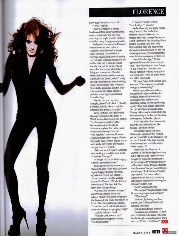
In this double page spread there are three columns containing a different sort of article style. An interview was conducted with the artist Rihanna which is made obvious by the bold text used in the questions asked by the interviewer. The questions follow with honest answers as the article states 'you demanded answers' shwoing that the reader specifially asked for these to be answered truthfully. This makes the article more interactive and potentially more interesting to the reader as their personal questions may have been answered by Rihanna herself. Similarly to the other articles you can see that the text starts with a larger first letter to show clearly where the article begins. I will most definitley by using this idea as i think it is effective because it is clear for the audience to focus on. I will be using the interview style also as the questions made are more interesting to read as a teenager magazine audience myself. I realise that this has more potential to be read by the reader as the target audience I am trying to attract is young women in a mainstream pop magazine double page spread. 


In this issue of NME the vaccines are used for the double page spread. There are two small text columns on the right hand side of the page. The language is very playful and informal attracting a similar audience to my target audience. The audience are then not intimidated by the text written and can relate to the style chosen. I believe teenagers can relate to this article because it is clear and friendly using words such as 'chap' and playful sentences like 'unless you've been living under a rock'. This is humorous and creates a connection between the audience and the article. The text is very biased and shows very positive aspects of the band encouraging them to seem all the more like able 'generated the frothing hype'. The hype built from the band attracts the reader to read on and are curious for the up and coming band to continue. There are numerous quotes highlighting their ambitious fresh attitudes for example 'we are a pop band and we want to be a pop band'. As this quote stands out sandwiched in between the column, it intrigues the audience to find the location of the quote in the article and persuades them to read on. I would like to make my text as playful as possible to interact with the audience in the most relatable way, whilst keeping the article informative. No swearing is mentioned keeping a clean outlook on the fresh new band. This may be to not create and aggressive reputation and look as likable as possible. 


Informal colloquial language is used straight away with the word 'plucky'. This makes him seem friendly and fresh for the readers who are unaware of the new singer on the scene. However this is contradicted with the quote in the frist paragraph 'It's my job to keep that X factor shit off the top of the charts'. Although this may be offensive to those readers, magazine targets a more offstream music industry and so are using Jake Bugg to channel this idea. The fact that the swear word is included clearly suggests that the audience are of an older teenage scale not yet as mature as some other audiences like middle aged women that read magazines such as Cosmopolitin.  He is considered a 'guitar godhead' and has many positive connotations surrounding him. One of his song lyrics is used as the headline which is very effective as it attracts previous fans of his along with encouraging new fans. 


Analysis of main images


Analysis of the images used in example magazines


The subject matter 'Lana Del Ray' is featured pulling a silly face which supports the quote shown below 'I'm a psycho!' This association with the text is a common convention for the main image as the link makes the article seem more interesting and personal. I will be doing this with my front image and similarly using a quote to make the link. The magazine uses a mid shot just on the waist of the artist to show the arms positioned on the hips and also the crazy facial expressions. The type of shot also leaves enough space for the text to fill the page and to frame the body so that the main features such as the face is shown clearly and stands out.  There is bright lighting which shows brilliant shadows reflecting on the background which involves the American flag behind Lana Del Ray. This simple image suggests that the artist is representing America and supports the quote 'modern American Icon'


In the double page spread the image takes up the left hand side of the page and so needs to be effective. The image has been edited to black and white which emphasises the brightness and contrast on the face. She pulls a face similarly to the main image showing that the photo was taken from the same photoshoot. The American flag is still in the background but the lack of colour suggests her importance. 


In this image used for the NME magazine Rihanna is used in a mid shot. This shot seems to be common in front covers and I think I may channel this idea through my photoshoot as I am using a rising teen popstar similar to the artists on the example covers. Rihanna is slightly tilted on the page with a crystal bird resting on her shoulder. This bird matches the make up used on her face such as the bright blue eyeshadow. The lipstick used also matches the text colour used in the headline and title of the magazine. This mise en scene is important to study during a photoshoot which is why I will plan the clothes, props, hair and make up before I start shooting. The background of the photo is very plain which is simple but effective and I can adapt this idea as my own using the school studio.

The other image used for the double page spread is very similar to the front page. It is also a mid shot with the bird still in the frame but the facial expression has changed and the position of the arms have changed. The angle used for the double page spread is front on with a plain background to not take any focus off of Rihanna. There is a slight shadow created on the background from the artist which shows that it has been taken in a studio. 

Florence Welch for Q Magazine UK March 2012 - florence-the-machine Photo


In this issue Florence is used in a close up with most of her hair acting as the background for the surrounding text. Her face is very central and brightly effected by the lighting. This pale effect is enhanced by the rich colour in her hair. The make up used also plays with colour and like the Rihanna front cover the eyeshadow matches some of the text colours on the page. The deep nail varnish blends in with the dark shadows created by the big hair. The fact that the quote is 'I feel so alone' is enhanced by the fact the image is so close up and personal. This makes the audience feel like they have an inside on the information. It appears like she is trapped in the magazine frame and feels alone as she is the only person that fills the front page. I think I will use this idea of the image controlling the position of the text in my main image.

In the double page spread image used for this issue of Q Florence the image is very different compared to the front cover photo. She appears to be in mid dance and the photographer has cleverly captured the moment as her hair is flowing in the air. This portrays the idea that she is a fun character up for a laugh. The focus of the head and hair is also not taken away as the clothes she is put in are all black and simple creating a unique silhouette. 


In this issue of Q magazine the image is of Lady Gaga stripped naked covering her privates with her hand a very large black glove. This suggests to the reader that they will have an honest article to read with all her secrets unfolded. Her body is imposed over some of the text then sent behind another part of the text creating a zig zag effect. Her make up and hair is crazy to reflect on her crazy peronality and hopefully crazy interview. Q have matched the black clothing to some of the text which is what I will do in my magazine with the make up. For instance I will use red lipstick and red text in my front cover. The aggressive black spikes used on the clothing could be suggesting a fiesty article with intimidating facts.


A closer image is used for the double page spread. This suggests that the reader is intrigued to read the article as the image is drawing you in closer. The photo has been edited to black and white which emphasises the shadows on the body especially on the cheekbones making the image look like a high angle. A necklace has now been added to cover her nakedness. 


The close up on Amy Winehouse is on a high angle in NME's front cover. The fact she is looking up to the camera slightly suggests that the audience are more superior to her. This makes us feel less intimiadated by the tattoos clearly on show from the image used. The text positions also highlight this as 'Blake's pocket' is made very clear. Her dark hair matches her dark costume along with the black eyeliner and eyeshadow. There is a soft light shining on her face suggesting her soft side in her 'secret studio sessions'. Like lots of magazine front covers the artist is looking straight at the camera to engage with the audience. This is a common convention which I will take on board when shooting for my front cover. 


Saturday 9 February 2013

Analysis of Double Page Spreads


The conventions of a double page spread feature in magazines such as Kerrang. The image above uses elements of similar colours reflecting on the background image of the band. For instance the editor uses red font to compare against the red t-shirt of the main singer in the middle of the image, over crossing the centre line. The red text stands out in some parts of the page to highlight important parts of the text. I will use this technique of producing an image that relates back to the colour scheme of the fonts on the double page spread. 

In this double page spread there is a distinct feature that is eye catching and effective. The bold black font of the artists name is then repeated as the starting letter of the writing. This convention is used in most magazines and lets the reader know when the main text begins. I will most definitely be using this as it adds a little extra to the page if the image is not too dominant. The text is then placed around the S that starts the text which is similar to other magazines. 

In this magazine the double page spread is very different to one that would feature in a rockier magazine. The feature I would like tp portray in my magazine is the fact that the text that is an interview has elements of bold serif font which sections normal serif font. This distinguises the questions from the answers and makes the page more interesting. There is also the convention of 3 columns in this double page spread which is easy on the eye and not too much information to take in. I will have 3 columns of writing in an interview form to keep the interest of the constituent audience.


This double page spread has a smaller image imposed over the text. This gives the reader something else to look at whilst not taking too much focus off the main larger image on the left. The smaller image is normally the artist in a different position or working backstage or in a different location. I will be using this idea of the smaller image in my double page to fill some space. Another interesting feature of this page is the quote added over the main text. It spans across the main content and the image suggesting its importance on the page. If I find an interesting quote I may add this to my project. 


In this final double page spread they use a plug on the right hand side. This stands out from the black backround as the red matches the title 'I was a teenage head'. I have noticed that the primary colour red is very common in most music magazines as it is striking and bold. It is most effective when combined with darker colours. The font is also interesting for this piece as it contrasts from the rest of the writing suggesting that it was an opinion made by the band member which represents their personality and what they represent. I hope to recreate this effect in my double page spread text fonts and colours.

Analysis of contents pages


Kerrang's contents page uses half of the page for a main image highlighting the chaotic atmosphere they are trying to portray. The top half is unusual to have an image come before text which is common for contents pages. I will be using this idea of using a large image to not make the page look uninteresting. The sharp contrast from picture to text is effective I believe. In this particular image on Kerrangs page, the sharp contrast goes from black to white using a variety of colours. I hope to make mine professional yet colourful. Another feature of this page that I hope to interpret is the extra images all over the page with captions on the sides and below. This adds a little extra content to the page without distracting the impression of the main image. I like this idea and hope to add as many images as possible without making it look too busy. 


In Q magazine the contents page has a big title across the top on a banner. This highlights what the page consists of and is in a bold font which is neat and clear. There is also the date on the side in a smaller and less bold coloured font. This banner across the top is then repeated on a smaller scale which frames the middle image very nicely. The light colour of the banner also contrasts from the darker backround of the grey image. It also matches with the artists top on purpose to get a professional and smart looking effect. Other magazines use this technique to match the colours in features such as text, border backrounds and logos. Also sticking to certain colours means that the page is not too busy and distracting from the information they are trying to portray. 


NME's contents page uses an effective subheading backround to text. The black gives a brilliant base to the bold white of the text. This distinguises the sub heading from the information below and splits the mass amount of text in one section. I think I will use this idea for my contents page as it makes the page more diverse and interesting. Another point about this contents page is that the logo colour that is used in the top left corner is then repeated in the bottom left corner. It causes the audiences eyes to fall between these two points in a unique way as the red is a prominant primary colour. 


Mojo uses a slightly more unique approach to the main image as it it dominant and the other features are dependently placed in positions that are appropriate to the photo. I like this contents page on the left because of the way the body position of the artist effects the text position on the left making it swerve in sync with the body. It looks interesting and the colours match the image subject matter. The red reflects on the red hair of Florence Welch whilst the white text used for the information contrasts boldly against the black costume she is wearing. This mise en scene is very effective and I hope to photograph an image that creates a style which is appropriate for my target audience just like the indie stereotypes that are the general audience for the magazine NME.

Top of the pops contents page separates its contents into different sections. This gives the reader plenty to look at without overloading them with too much text. They also use an Inside the mag feature which I will interpret in my contents page as it uses the most attractive looking stories to encourage the reader to buy it. The girly colour scheme and specific subject matters of this magazine suits its target audience and I will use this effect to attract a more general music lover.