Q Magazine uses big bold writing overpowering the smaller writing in a different colour usually white to stand out against the image. They also use long or mid shots for the main image to show the whole body language and facial expressions of the artist used on the front cover. There are a variety of text fonts used in most magazines to suggest variety in the brand-names. NME tends to stick to upper case which suggests loudness and important information is needed to be observed.
Barcodes are placed nearer the bottom of the page over the main image. The image is imposed over the title in most magazines such as Q indicating the maturity of the brand magazine and how they have been going on for a long time. A circular shape is also common as a little extra to put in front of the main image. It fills some space and enhanced the variety of shapes and colours on the page. For example NME promotes to win Isle of Wight tickets which is based in a blue colour circle contrasting against the black and red colours used in the set of the cover.
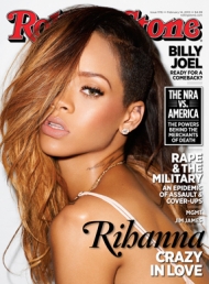
Rolling Stone magazine uses popstars and mainstream artists as a way to encourage their audience to take a closer look. By putting an image of Rihanna imposed over the Rolling Stone title suggests she has taken over this issue, overpowering, thus creating constituencies for her fans and followers to buy the magazine. Rihanna written in black ink across her skin has connotations of tattoos which gives the magazine an urban edge. This title is written in italics differing from the less noticeable subheading below her name 'crazy in love'. The black and white contrast is a simple and common text colour choice used in other magazines. One other thing to realise about this magazine front cover is that all of the text is written in UPPER CASE apart from the Rolling Stone title and Rihannas name. This suggests the importance in the star on the front cover. In my magazine front cover I will follow this convention as I think it creates an immediate connection with the audience to the initial image on the page. The image is dominant and therefore has most of the importance.
Q magazine uses a trademark logo in the top left corner. This distinguises the brand in the market and is instantly recognisable. I hope to interpret this idea of unique well known connotations in my magazine front cover and create a title/logo memorable enough to resemble a well known magazine. Some images are imposed over the title which is what I will do in my magazine. Another interesting code Q features in all of their front covers that there is always the usual 3 colours used in the text: black, white and red. Red is obvious to match the title and black and white are good contrasting colours used in most texts. I will be using a specific combination of colours in my text on my fron cover.

No comments:
Post a Comment