Analysis of the images used in example magazines


The subject matter 'Lana Del Ray' is featured pulling a silly face which supports the quote shown below 'I'm a psycho!' This association with the text is a common convention for the main image as the link makes the article seem more interesting and personal. I will be doing this with my front image and similarly using a quote to make the link. The magazine uses a mid shot just on the waist of the artist to show the arms positioned on the hips and also the crazy facial expressions. The type of shot also leaves enough space for the text to fill the page and to frame the body so that the main features such as the face is shown clearly and stands out. There is bright lighting which shows brilliant shadows reflecting on the background which involves the American flag behind Lana Del Ray. This simple image suggests that the artist is representing America and supports the quote 'modern American Icon'
In the double page spread the image takes up the left hand side of the page and so needs to be effective. The image has been edited to black and white which emphasises the brightness and contrast on the face. She pulls a face similarly to the main image showing that the photo was taken from the same photoshoot. The American flag is still in the background but the lack of colour suggests her importance.


In this image used for the NME magazine Rihanna is used in a mid shot. This shot seems to be common in front covers and I think I may channel this idea through my photoshoot as I am using a rising teen popstar similar to the artists on the example covers. Rihanna is slightly tilted on the page with a crystal bird resting on her shoulder. This bird matches the make up used on her face such as the bright blue eyeshadow. The lipstick used also matches the text colour used in the headline and title of the magazine. This mise en scene is important to study during a photoshoot which is why I will plan the clothes, props, hair and make up before I start shooting. The background of the photo is very plain which is simple but effective and I can adapt this idea as my own using the school studio.
The other image used for the double page spread is very similar to the front page. It is also a mid shot with the bird still in the frame but the facial expression has changed and the position of the arms have changed. The angle used for the double page spread is front on with a plain background to not take any focus off of Rihanna. There is a slight shadow created on the background from the artist which shows that it has been taken in a studio.

In this issue Florence is used in a close up with most of her hair acting as the background for the surrounding text. Her face is very central and brightly effected by the lighting. This pale effect is enhanced by the rich colour in her hair. The make up used also plays with colour and like the Rihanna front cover the eyeshadow matches some of the text colours on the page. The deep nail varnish blends in with the dark shadows created by the big hair. The fact that the quote is 'I feel so alone' is enhanced by the fact the image is so close up and personal. This makes the audience feel like they have an inside on the information. It appears like she is trapped in the magazine frame and feels alone as she is the only person that fills the front page. I think I will use this idea of the image controlling the position of the text in my main image.
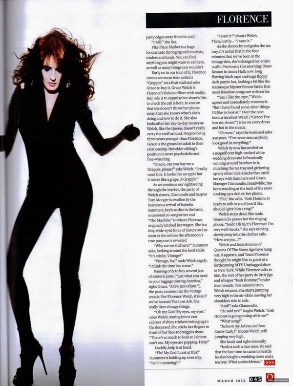
In the double page spread image used for this issue of Q Florence the image is very different compared to the front cover photo. She appears to be in mid dance and the photographer has cleverly captured the moment as her hair is flowing in the air. This portrays the idea that she is a fun character up for a laugh. The focus of the head and hair is also not taken away as the clothes she is put in are all black and simple creating a unique silhouette.

In this issue of Q magazine the image is of Lady Gaga stripped naked covering her privates with her hand a very large black glove. This suggests to the reader that they will have an honest article to read with all her secrets unfolded. Her body is imposed over some of the text then sent behind another part of the text creating a zig zag effect. Her make up and hair is crazy to reflect on her crazy peronality and hopefully crazy interview. Q have matched the black clothing to some of the text which is what I will do in my magazine with the make up. For instance I will use red lipstick and red text in my front cover. The aggressive black spikes used on the clothing could be suggesting a fiesty article with intimidating facts.

A closer image is used for the double page spread. This suggests that the reader is intrigued to read the article as the image is drawing you in closer. The photo has been edited to black and white which emphasises the shadows on the body especially on the cheekbones making the image look like a high angle. A necklace has now been added to cover her nakedness.

The close up on Amy Winehouse is on a high angle in NME's front cover. The fact she is looking up to the camera slightly suggests that the audience are more superior to her. This makes us feel less intimiadated by the tattoos clearly on show from the image used. The text positions also highlight this as 'Blake's pocket' is made very clear. Her dark hair matches her dark costume along with the black eyeliner and eyeshadow. There is a soft light shining on her face suggesting her soft side in her 'secret studio sessions'. Like lots of magazine front covers the artist is looking straight at the camera to engage with the audience. This is a common convention which I will take on board when shooting for my front cover.
No comments:
Post a Comment